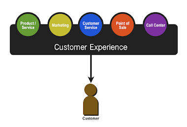
With most brands, I wouldn’t take the time to point out the flaws and also give them tips on how to improve my customer experience. I felt in this case that Dunkin Donuts had the opportunity to not only gain some insight from a loyal customer(23 years in the making), but also hear how their various divisions were communicating with each other.
Today’s DOodle! Enter the DUNKIN’ DONUTS customer experience, offline to online on this 2nd day of February:
- Received my sample package of DUNKIN’ DARK Dark Roast in the mail or so I thought …?
- The package shows Dunkin Donuts ORIGINAL BLEND Medium Roast on the front.
- I inspect the box like the multichannel marketer I am to discover lack of website URL anywhere on the packaging.
- I pull out the insert pouch. AH HA! The website URL is printed in like 6 point font on the back.
- I head over to the website: www.dunkinathome.com
- Where do I give customer feedback?
- I click on the cool little blog tag button and my popup blocker denies their popup window quickly.

No comments:
Post a Comment